<link> : External Resource Link element

Introduction

The <link> element in HTML is used to link external resources to a web page. It is commonly used to link stylesheets for styling, but it can also be used to link other types of external resources, such as icons or alternative style sheets.

Example of linking a Stylesheet:

In this example, the <link> element is used to link an external stylesheet named “styles.css” to the HTML document. This allows the web page to apply styles defined in the linked stylesheet.

Example of linking an Icon:

In this example, the <link> element is used to link a favicon (a small icon displayed in the browser’s address bar or tab) named “favicon.ico” to the HTML document.

Other Use Cases:

  • Linking alternative stylesheets for different media types, such as print stylesheets.
  • Linking external scripts using the rel="preload" attribute for better performance.
  • Linking a web page to a related document, such as a syndication feed.

The <link> element is placed within the <head> section of an HTML document. It uses the rel attribute to specify the relationship between the current document and the linked resource, and the href attribute to specify the URL of the external resource. The specific attributes used with <link> depend on the type of resource being linked.

<li> : List Item element

Introduction

The <li> (list item) element in HTML is used to define individual items within ordered lists (<ol>) or unordered lists (<ul>). It is a container element that holds the content of each list item. Here’s how it is typically used:

Example with Unordered List (<ul>):

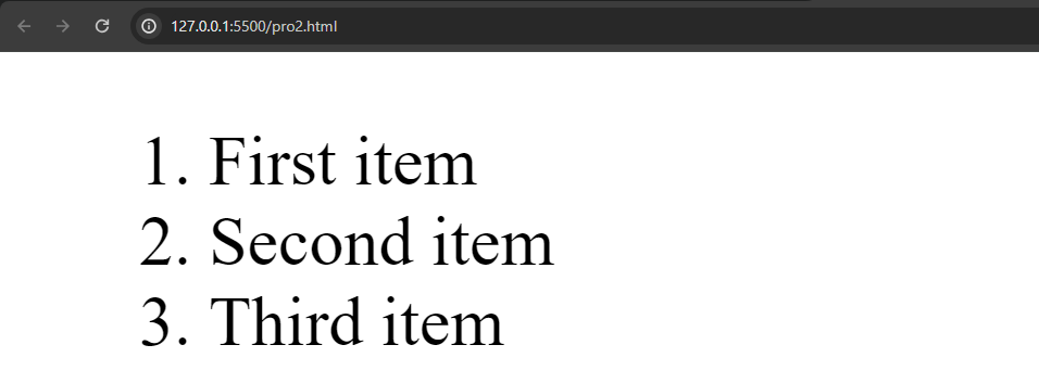
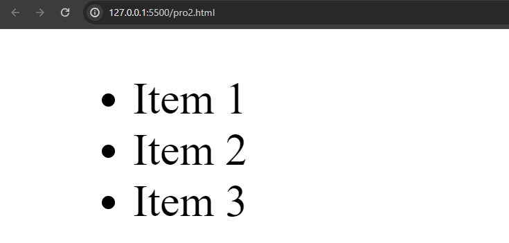
Output :

In this example, each <li> element represents an item in an unordered list.

Example with Ordered List (<ol>):

Output :

Here, each <li> element represents an item in an ordered list, where the order of items matters.

Nested Lists:

Lists can also be nested, where an <ul> or <ol> element is placed inside an <li> element to create a sublist:

In this example, “Main item 2” has a nested unordered list as a sublist.

The <li> element is a fundamental building block for creating lists in HTML, and it is essential for conveying structured information on a webpage. Lists can be styled using CSS to achieve various visual presentations, such as changing bullet points or numbering styles.

<legend> : Field Set Legend element

Introduction

The <legend> element in HTML is used in conjunction with the <fieldset> element to provide a caption or description for a group of related form elements. The <fieldset> element is used to group and semantically associate form controls, and the <legend> element serves as a title or explanatory text for that group.

Here’s an example of how <fieldset> and <legend> are used together:

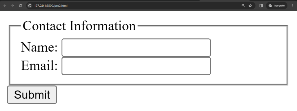
Output :

In this example:

  • The <fieldset> element groups together the form controls related to contact information.
  • The <legend> element provides a title, “Contact Information,” for the group of form controls.

This is particularly useful for creating more structured and accessible forms. The use of <legend> helps users understand the context of the form controls within the fieldset, especially when there are multiple sections or groups of controls on a form.

It’s important to note that the <legend> element should be the first child of the <fieldset> element. Additionally, using <fieldset> and <legend> is optional, and they are typically used when there’s a need to semantically group related form controls.

Uses of <legend> tag :

Here are some common uses and benefits of the <legend> tag:

1. Grouping Form Controls: Grouping related form controls under a common title, making the form more organized and providing context to the user.

2. Accessibility: The <legend> tag helps screen readers and other assistive technologies provide a better understanding of the purpose and context of the grouped form controls.

3. Styling: Developers can style the <legend> element to enhance the visual presentation of the form. For example, changing the font size, color, or adding background styles.

4. Form Structure: Dividing a form into logical sections, such as shipping and billing addresses, for better organization and user experience.

5. Internationalization: Providing a <legend> for each fieldset can aid in internationalization efforts by making the form structure more understandable across different languages.

It’s important to note that while the <legend> tag is a useful tool for organizing and enhancing the accessibility of forms, it is not mandatory for every form. It is most beneficial in situations where grouping form controls under a common title adds clarity to the form structure.

<label> : The Label element

Introduction

The <label> element in HTML is used to associate a label with a form control, providing a more accessible and user-friendly interface. It is often used in conjunction with various form elements, such as <input>, <select>, <textarea>, and more.

Here’s an example of how the <label> element is typically used with an <input> element:

Output :

In this example:

  • The <label> element is associated with the <input> element using the for attribute, which has the same value as the id attribute of the corresponding form control (id="username" in this case).
  • When a user clicks on the label, it focuses or activates the associated form control. This improves accessibility and makes it easier for users to interact with the form.

You can also nest the form control directly within the <label> element:

In this case, the association between the <label> and <input> is implied by the nested structure.

It’s worth noting that while associating a label with a form control is good practice, it’s not always necessary for certain types of form controls, such as buttons or checkboxes, especially when the context is clear without an explicit label.

<kbd> : Keyboard Input element

Introduction

The <kbd> element in HTML is used to define keyboard input. It represents user input as it would be entered by the user from the keyboard. The content within the <kbd> element is typically displayed in a way that indicates it represents keyboard input, such as using a monospaced font.

Here’s an example of how the <kbd> element can be used:

Output :

In this example, the keyboard shortcut for saving a document is presented with the key combinations enclosed in <kbd> tags. The rendering of the content within <kbd> may vary depending on the browser, but it’s often displayed in a way that resembles the appearance of keys on a keyboard.

Attributes like “for” can be used to associate the <kbd> element with a specific input element:

Output :

In this example, the <kbd> element is associated with the “Enter” key, indicating that pressing the “Enter” key is equivalent to clicking the associated button.

The <kbd> element is useful when documenting keyboard shortcuts, providing clarity to users about which keys or key combinations they should press. It is often used in technical documentation, tutorials, and user manuals where keyboard input instructions need to be conveyed.

<ins> : Inserted Text element

Introduction

The <ins> element in HTML is used to represent text that has been inserted into a document. It is typically used in conjunction with the <del> (Deleted Text) element to show content changes over time. The <ins> element is commonly used in version control systems, collaborative editing environments, or any situation where it’s necessary to highlight added or inserted text.

Here is an example :

Output :

In this example:

  • <del> is used to represent deleted or removed text.
  • <ins> is used to represent inserted or added text.

In the second paragraph, the changes between the original and modified text are visually highlighted. The word “The” is deleted, and the word “A” is inserted. Similarly, “the” is deleted, and “a” is inserted.

Attributes like ‘datetime‘ can be added to provide additional information about when the changes were made.

For example:

In this case, the ‘datetime‘ attribute provides timestamps indicating when the changes were made. This information can be useful in applications that track document revisions or edits.

It’s worth noting that while the <ins> and <del> elements are part of the HTML specification, their visual rendering may vary depending on the browser, and developers often use CSS to customize the appearance of inserted and deleted text.

<input> : Input (Form Input) element

Introduction

The <input> element is a fundamental part of HTML forms, allowing users to input data that can be submitted to a web server for processing. It is a versatile element with various types and attributes to handle different types of input.

Here is a basic example of the <input> element:

Output :

In this example:

  • type: Specifies the type of input. In the example, there are two inputs with types text and password.
  • id: Provides a unique identifier for the input element. This is often used in conjunction with a <label> element’s for attribute to associate the label with the input.
  • name: Defines the name of the input, which is used when submitting the form data to the server.
  • required: Indicates that the input must be filled out before submitting the form.

Common types of the <input> element include:

1. Text Input: Collecting single-line text input from the user, such as a username or search query.

2. Password Input: Collecting sensitive information like passwords, where the entered characters are obscured.

3. Checkbox: Allowing users to select multiple options or agree to terms and conditions.

4. Radio Buttons: For exclusive options where users can choose only one from a group of options.

5. Submit Button: Triggering the form submission to send user-entered data to the server for processing.

6. Reset Button: Resetting form fields to their default values.

7. File Input: Allowing users to upload files to the server.

8. Hidden Input: Storing data on the client side that is not meant to be visible or modifiable by the user.

9. Number Input: Accepting numerical input with optional constraints (minimum, maximum values).

The <input> element can have various attributes depending on its type and purpose, allowing developers to control behavior, validation, and appearance.

<p> : Paragraph element

Introduction

The <p> element in HTML is used to define paragraphs in a web page. It represents a block of text with some separation from the surrounding content. The <p> element automatically adds space above and below the enclosed text, making it visually distinct as a paragraph.

Here’s a simple example of using the <p> element:

Output :

In this example:

  • Two <p> elements are used to create two separate paragraphs.
  • The text inside each <p> element is automatically formatted with space above and below it, making it visually distinct.

Key points about the <p> element:

1. Text Separation: It is primarily used to separate and structure blocks of text into paragraphs.

2. Automatic Formatting: Browsers automatically add space above and below the text enclosed in a <p> element, providing a clear visual separation from other content.

3. Whitespace Handling: Extra whitespace, such as line breaks and spaces, is typically normalized within a <p> element. This means multiple consecutive spaces or line breaks are treated as a single space.

4. Nesting: The <p> element cannot contain block-level elements, but it can contain inline elements and text.

5. CSS Styling: Developers can apply CSS styles to customize the appearance of paragraphs, adjusting aspects such as font size, line spacing, and margins.

In summary, the <p> element is a fundamental HTML element for organizing and presenting text content in a structured manner on a webpage. It plays a key role in maintaining readability and visual hierarchy.

<img> : Image Embed element

Introduction

The <img> element in HTML is used to embed images in a web page. It allows you to include images from local files or remote sources. The <img> element is self-closing, meaning it doesn’t have a closing tag.

Here is an example :

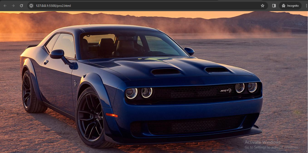
Output :

In this example:

  • The src attribute specifies the source URL or file path of the image.
  • The alt attribute provides alternative text for the image. This text is displayed if the image cannot be loaded and is also used by screen readers for accessibility.

Additional attributes commonly used with the <img> element:

  • width and height: Specify the width and height of the image in pixels.
    • <img src=”example.jpg” alt=”Description” width=”300″ height=”200″>
  • style: Apply inline CSS styles to the image.
    • <img src=”example.jpg” alt=”Description” style=”border: 1px solid #ccc;”>
  • class and id: Assign CSS classes or IDs to the image for styling or scripting purposes.
    • <img src=”example.jpg” alt=”Description” class=”image-style” id=”unique-image”>
  • Responsive Images: Use the max-width: 100%; style to make images responsive within their containers.
    • <img src=”example.jpg” alt=”Description” style=”max-width: 100%;”>

Make sure to provide meaningful alternative text (alt attribute) for images to enhance accessibility and ensure a good user experience, especially for users with visual impairments or when images cannot be loaded.

<i> : Idiomatic Text element

Introduction

The <i> element in HTML is used to represent text that is set in italic or emphasized style. However, it’s important to note that in HTML5, the <i> element is considered a presentational element, and its use is often discouraged in favor of more semantically meaningful alternatives.

Example:

Output :

Anything we write in ‘<i>‘ tag it will show in italic style just look like in above image.